Let us consider a simple scenario to understand how you can use the Burn Up chart to analyze how much work has been completed in a sprint.
Consider Jill, a Project Manager, who handles a team of developers, testers, and UI engineers. Jill's team works in an agile environment where, resources work on multiple projects simultaneously. Project Managers, across functions, often use two types of charts to track the progress of their projects. One is the burn down chart which shows how much work is remaining at the end of a sprint; and the other one is the burn up chart which shows how much work was completed in a given sprint.
At the end of every sprint, Jill can use the Burn Up chart to gain insights into the following parameters:
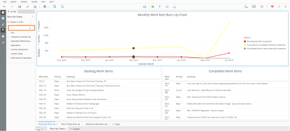
Within the Work Item Burn Up Chart, Jill has access to information in three different graphs:
Jill can switch tabs to the Story Points Burn Up page to view the same set of graphs plotted on the basis of story points instead of number of work items.
The Business Value Burn Up page, similarly, displays graphs plotted on the basis of business value.
Following is a sample burn up chart:
The line graphs in the Burn Up dashboard can give valuable insights. Some of the analyses that Jill can look for are:
Related Topics
© 2022 Digital.ai Inc. All rights reserved.