The Release Executive Overview dashboard provides a snapshot view of your overall Release status in terms of the progress, number of successful releases, variances in schedule, risk associated with the release, and so on.
As a Release Manager, you can also understand the performance of individual release owners or teams with respect to releases and take measures to help improve a team's success rate. For example, you might want to investigate teams with high schedule variance or risks to understand if the teams are burdened with a lot of manual tasks.
As a Release Manager, you can use this dashboard to understand the following business scenarios:
The data displayed in this dashboard pertains to the last 30 days and includes active and archived releases. The default time frame can be modified to suit your business requirement.
The Release Executive Overview dashboard consists of the following chapters:
The Release Overview chapter focuses on providing insights with respect to the operational efficiency of releases, such as number of releases, success/failure count, releases that require attention based on risk scores, snapshot view of the release time lines, variances, and so on.
This chapter consists of the following sections:
Displays a donut chart with information related to the total number of completed, ongoing, and upcoming releases. The slices in the chart are color coded to indicate each release status and you can hover over each slice to view the percentage contribution of releases across each status.
Displays a donut chart with information related to the number of successful and unsuccessful releases that completed in the last 30 days. A completed release is said to be successful if it is completed within the planned end date and if its Release Risk status is 'On Track' (risk score is less than 20).
The slices in the chart are color coded to indicate the release efficiency and you can hover over each slice to view the percentage contribution of releases towards success and failure.
Displays a donut chart that provides information about the average percentage of Risk Score across all releases. The colored slice in the chart indicates the percentage releases contributing towards the average Risk score.
The Risk scores are calculated in the source system and are based on various factors like failed or failing states, due dates, or flags.
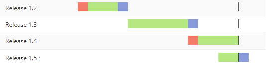
Displays a grid providing a summary of releases along with a Gantt chart illustrating the release time line, its progress, and variance. The Release schedule bar graph is color-coded, and each section of the graph denotes the duration with respect to delay in start, active duration, and schedule variance. The starting point of the graph indicates the planned start date of the release and the solid line indicates the planned end date.
You can also view details, such as the name of the Release, Release Owner, planned start date of the release, completion percentage of the release, schedule variance between planned duration and actual duration, Risk score for each release as specified in the source, and the actual duration of the release.
The Risk score values are calculated in the source system and are based on various factors like failed or failing states, due dates, or flags. The colors visually denote the risk scores based on the following predefined thresholds:
Note: These values are the default out-of-the-box values and can be configured based on your requirements.
This section lists all the attributes and metrics that have been used to build the reports in this dashboard.
Attributes
| Attribute Name | Description |
|---|---|
| Status |
Current status of the release, such as In Progress, Paused, Aborted, Completed, and so on. |
| Release | Name of the Release. |
| Owner | Name of the person who is in charge of the Release. |
| Planned Start Date | Displays the date on which the Release is supposed to start. |
Metrics
| Metric Name | Description | Metric Formula |
|---|---|---|
| Release Volume | Total number of Releases created for a specific period. | Count([Release Volume]) |
| No. of Successful Releases | Total number of completed releases that are completed within the planned end date and with the Release Risk status as 'On Track' (risk score is less than 20). | Count([No of Completed Releases])<[Release Successful = Y]> |
| No. of Unsuccessful Releases | Total number of completed releases that are not successful. | [No of Completed Releases] - [No of Successful Releases] |
| Release Risk Score |
Average risk score across Releases as calculated in the source. |
Avg([Release Risk Score]) |
| % Completed | Sum of percentage actual completion of a Release as compared to its planned end date. | Sum([Release Actual % Complete]) |
| Schedule Variance (Days) | Variance (in days) in Release schedule calculated as the time difference between actual duration and planned duration of the Release. | [IF(([Release Actual Duration] > [Release Planned Duration]), (([Release Actual Duration] - [Release Planned Duration]) / 86400), 0)] / [Count([Release Volume])] |
| Actual Duration (Days) | Actual time (in days) taken for the Release from start to complete. | [Release Actual Duration] / (86400 * [Release Volume]) |
The Release Performance View chapter focuses on providing insights into the performance of Release owners and teams and understand areas of improvements. You can view details such as average schedule variance across releases, weekly trend of risk scores and variance, and drill down to view the performance of individual teams associated with a Release owner.
This chapter consists of the following sections:
Note: These values are the default out-of-the-box values and can be configured based on your requirements.
This section displays a bubble chart to denote the performance of Release Owners with respect to their successful releases and risk scores. Each bubble corresponds to a Release Owner and the size indicates the number of releases they own. The color of bubbles indicates the percentage of schedule variances across their releases and is categorized based on specified ranges.
The dotted line in the chart indicates the average value for successful release percentage and the average risk score across releases owned by the Release owner. You can also hover over each bubble to view detailed information.
You can click a particular Release owner to drill down and view data relevant to the owner in the subsequent sections.
Displays a combo chart that provides the weekly trend of Releases with respect to the average risk score and schedule variance and helps you understand if there are considerable improvements with respect to these metrics. The bar graph in the chart represents the average Risk Score and the line graph represents the average schedule variance.
If you have selected a particular Release Owner from the Release Owner's Release Performance section, the combo chart will display the trend specific to releases belonging to the selected owner.
Displays a grid that provides details information about teams and their performance with respect to the Releases that they are working on. You can view details, such as the Release name, associated teams, status of the Release, flag to indicate if the release was successful or not, average schedule variance, and the risk score.
This section lists all the attributes and metrics that have been used to build the reports in this dashboard.
Attributes
| Attribute Name | Description |
|---|---|
| Longest Release |
Name of the Release that contains the longest actual duration. |
| Task Type with Most Failed Tasks | Name of the Release Task Type that contains the highest percentage of failed tasks. |
| Owner | Name of the person who is in charge of the Release. |
| Release | Name of the Release |
| Team | Name of the team working on a Release |
| Release Status | Current status of the release, such as In Progress, Paused, Failed, Aborted, and so on. |
Metrics
| Metric Name | Description | Metric Formula |
|---|---|---|
| Avg Schedule Variance (Days) | Average variance (in days) in schedule across all releases and calculated as the time difference between actual duration and planned duration of the Release. | [IF(([Release Actual Duration] > [Release Planned Duration]), (([Release Actual Duration] - [Release Planned Duration]) / 86400), 0)] / [Count([Release Volume])] |
| Avg Actual Duration (Days) | Average actual time (in days) taken by Releases to move from start to complete. | [Release Actual Duration] / (86400 * [Release Volume]) |
| % Successful Releases | Percentage of completed Releases that are completed within the planned end date and with the Release Risk status as 'On Track' (risk score is less than 20). | [Count([No of Completed Releases])<[Release Successful = Y]>] / [No of Completed Releases] |
| Risk Score |
Average risk score across Releases as calculated in the source. |
Avg([Release Risk Score]) |
| Release Volume | Total number of Release created for a specific period. | Count([Release Volume]) |
| Successful Release - By Teams |
Flag to indicate if the team has successfully completed the tasks associated with the Release. |
Max([No of Releases by Team])<[Release Successful by Team Flag = Y]> |
| Avg Schedule Variance (Days) - By Teams |
Average schedule variance of tasks associated to the Release that the team is working on. Calculated as difference between actual duration and planned duration of tasks. |
[Release Schedule Variance Duration By Team] / 86400 |
| Risk Score - By Teams |
Internal metric that displays the average risk scores of Release tasks executed by the team. The Risk score is calculated on the basis of number of tasks that are At Risk, Need Attention, failures, and over due |
Avg([Release Risk Score By Team]) |
© 2022 Digital.ai Inc. All rights reserved.